 |
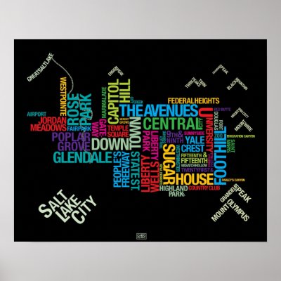
| This is a terrible map. |
 |
| It imitates this far more successful map. |
The latter map is based on
actual neighborhood boundaries, and does a far better job of representing the actual size of different neighborhoods, and their actual relation to one another. Come to think of it, I've never actually seen a good map of Salt Lake City's neighborhoods. I'll have to take a shot at it sometime.

No comments:
Post a Comment
And your thoughts on the matter?