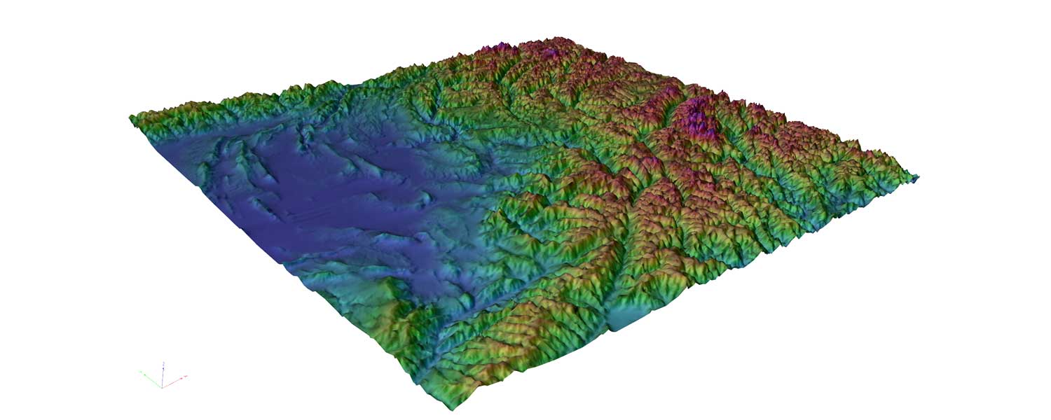
Think of a raster surface. Not just a 2D raster, but a 3D topology.


Metroscape calculates the area reachable from one point, yeah? Or rather, the 'Dynamic Accessibility Maps' does, from any zone of interest. When I say 'aggregation of start points', I'm thinking in GIS terms: Running the 'Dynamic Accessibility Maps' for each point, and then spatial joining the resulting polygons (one for each start point) together, summing the values in each polygon. And then making a chloropleth map of the resulting numbers. So it looks like this:
But that's just a cost distance, not an accessibility metric. To get an accessibility metric...
For every zone, run the Dynamic Map. Take the inverse of travel time (near things being more important than far things), as a Travel Time Score (TTS)--things with high TTS's are better. Then multiple the TTS for each destination zone by activity density, to weight how important a zone is as a destination (with each job counting as ~5 pop). Then, for each zone, you have a Zonal Access Metric. It's similar to minutes of delay, but accounts for the marginal value of time: A 5 minute increase matters a lot of a 20 minute trip, but not that much on a 130 minute trip. 20 minutes trips are also vastly more frequent, and hence more important. (Using aggregate minutes of additional travel time lost lacks this distinction).
Could also compare changes over time. Do the above for all zones for 2020. Do this for all zones in 2045, no-build. Compare. Will call out zones with the worse loss in access in no-built. Do it for the 2045 LRTP--will show which zones lose, and which zones gain.
Applications
-Where is accessibility most threatened by forecast changes?
-Which projects do the most to prevent loss of accessibility?
-Which projects most benefit low income households?
-Economic development planning: What areas are accessible now, and will be accessible in the future.
No comments:
Post a Comment
And your thoughts on the matter?